


Next: The NLANR OC3MON
Up: IETF Example Applications: NeTraMet,
Previous: The Traffic Flow Analyzer
Via menu options it is possible to choose different display modes
for the flow data. On the ordinate, nifty can display either packets or
bytes. Additionally, the metric (rate, count or percent) can be choosen.
These choices give the user the following possibilities for analysing
the network:
- 1.
- The total number of packets for each flow over the flow duration (i.e. the time between the first and the last packet seen for the particular flow) can be depicted, as shown in Figure 3.6.
- 2.
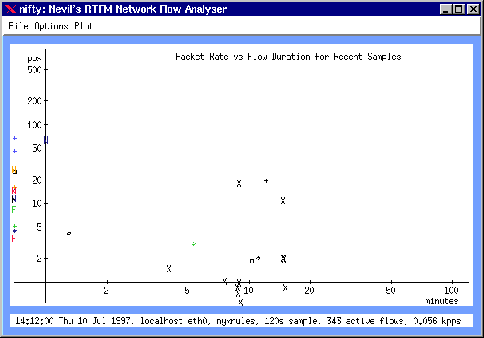
- In the same way, the ``packet rate'' r (i.e. the number of packets per second) can be depicted over the flow duration. The packet rate is computed as

where n is the number of packets observed in the last sample and  is
the length of the last sample. This plot is most useful for observing flows of short bursts. An example is shown in Figure 3.7.
is
the length of the last sample. This plot is most useful for observing flows of short bursts. An example is shown in Figure 3.7.
Figure 3.6:
Nifty displaying the packet count vs. the flow duration
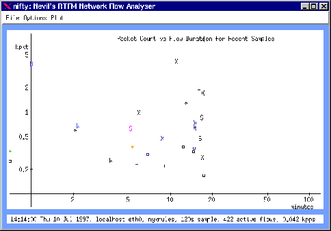 |
Figure 3.7:
Nifty displaying the packet rate vs. the flow duration
 |
- 3.
- Figure 3.8 shows the flow packet rate as a percentage of the total observed packet rate for the last sample.
- 4.
- The total number of bytes can be displayed over the flow duration, as in Figure 3.9. This plot is most useful for observing long-term high-volume flows.
Figure 3.8:
Nifty displaying the packet percentage vs. the flow
duration
 |
Figure 3.9:
Nifty displaying the byte count vs. the flow duration
 |
- 5.
- Figure 3.10 shows how the number of bytes per second, estimated from the counts and times observed for the last sample, can be displayed over the flow duration.
- 6.
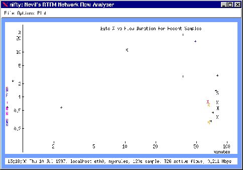
- The flow byte count can be displayed as a
percentage of total observed bytes for the last sample. Figure
3.11 shows an example for this.
Figure 3.10:
Nifty displaying the byte rate vs. the flow duration
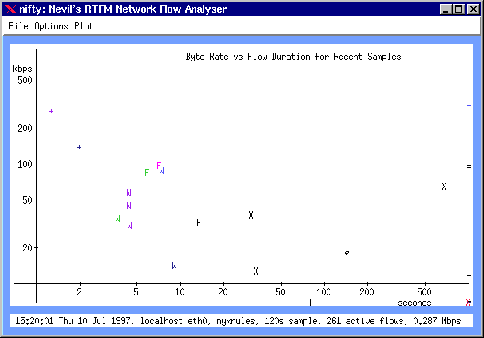 |
Figure 3.11:
Nifty displaying the byte percentage vs. the flow duration
 |
These methods to display the traffic information have shown to be very
valuable for getting rapid insights into the current state of the
network. Once one gets used to them, they allow the user an immediate
perception of the current traffic. Traffic sources producing excess
packets can be easily located in the chart. At the same time, the
different characters representing protocols allow a instantaneous
overview of the kinds of applications that are responsible for the
network load.
Next: The NLANR OC3MON
Up: IETF Example Applications: NeTraMet,
Previous: The Traffic Flow Analyzer
root
8/4/1997